Service Graph
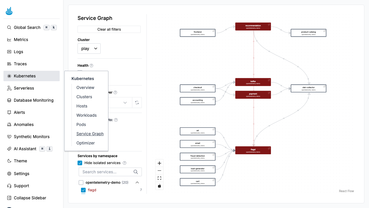
The Service Graph renders an interactive dependency map of the services running in your Kubernetes clusters. Nodes represent services and edges represent network communication between them, derived from observed traffic.
Getting Started
Navigate to Kubernetes → Service Graph in the sidebar. The graph auto-populates from network-level observations within the selected cluster and time range.
Reading the Graph
Nodes
Each node is a service (typically a Kubernetes Service or workload). Node color indicates health:
| Color | Meaning |
|---|---|
| Green | Healthy |
| Yellow | Elevated error rate |
| Red | High error rate or critical issues |
Edges
Directed arrows show the direction of network calls (caller → callee). Thicker edges indicate higher request volume.
Filters
The left-hand panel provides controls to focus the view:
- Cluster — Select which cluster to display.
- Health — Toggle Healthy, Warning, and Critical services.
- Namespace — Group and filter services by namespace.
- Hide isolated services — Remove services with no connections from the view.
- Service search — Find a specific service by name.
Interacting with the Graph
- Pan and zoom — Drag to pan, scroll to zoom. Use the toolbar for Zoom In, Zoom Out, and Fit View.
- Click a node — Opens a detail panel with the service's error rate, latency, and throughput.
- Hover an edge — Shows request rate and error rate for that connection.
Use Cases
- Dependency mapping — Understand which services talk to each other.
- Incident investigation — Identify failing upstream or downstream dependencies during an outage.
- Architecture review — Verify that services communicate only with expected dependencies.
Support
If you need assistance or have any questions, please reach out to us through:
- Email at [email protected]