Metrics Analyzer
Metrics Analyzer gives you a complete picture of your metrics estate — cardinality, cluster breakdown, and which dashboards or alerts consume each metric. Use it to identify high-cardinality offenders, unused metrics, and optimization opportunities.
Getting Started
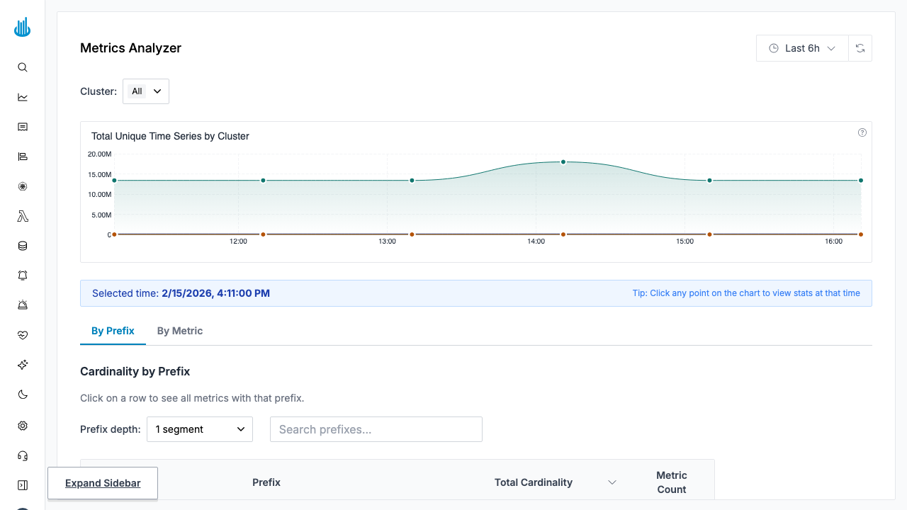
Navigate to Metrics → Analyzer in the sidebar. The page opens in the By Prefix tab by default.
Page Controls
| Control | Description |
|---|---|
| Clusters | Filter metrics to one or more clusters. |
| Time range | Choose the analysis window (e.g. last 24 h). |
| Total cardinality | Headline number showing total active time-series count across the selected scope. |
Views
By Prefix
The default view groups metrics by their name prefix (the
part before the first _). This is useful for understanding
which subsystems or exporters contribute the most
cardinality.
| Column | Description |
|---|---|
| Prefix | The shared name prefix (e.g. container_, node_). |
| Total Cardinality | Sum of active series for all metrics under this prefix, with a bar chart showing relative size and cluster breakdown on hover. |
| Metric Count | Number of distinct metric names under the prefix. |
Prefix depth — A dropdown above the table lets you control how many underscore-separated segments form the prefix (1, 2, or 3). Increasing the depth creates finer-grained groups.
Click any row to see the individual metrics within that prefix.
By Metric
Switch to the By Metric tab to see every metric individually.
| Column | Description |
|---|---|
| Metric Name | Full Prometheus metric name. |
| Cardinality | Active time-series count with a bar chart and cluster breakdown tooltip. Percentage of total is shown. |
| Dashboards | Number of Grafana dashboards that reference this metric. Click the count to view the list. |
| Alerts | Number of alert rules that reference this metric. Click the count to view the list. |
| Actions | A block button (visible on hover) lets editors create a drop rule for the metric directly. |
Additional controls in this view:
- Search — Filter the table by metric name.
- Show only unused — Toggle to surface metrics that appear in no dashboards and no alerts, making them candidates for dropping.
Metric Detail Panel
Click any metric row to open the detail side-panel with three tabs:
Stats
- Cardinality over time — A time-series chart showing how the metric's cardinality has changed, broken down by cluster (top 5 shown, rest grouped as "Others").
- Label cardinality table — Lists every label on the metric together with the number of unique values for that label. This helps pinpoint which label is driving high cardinality.
Dashboards
Lists all Grafana dashboards that reference the selected metric, with direct links to each dashboard.
Alerts
Lists all alert / monitor rules that use the metric, with links to each rule.
Workflow: Reducing Cardinality
- Open the Analyzer and sort the By Prefix view by Total Cardinality descending to find the largest contributors.
- Drill into a prefix to see which individual metrics are responsible.
- Click a metric to open the detail panel. Check the
Label cardinality table to identify the high-
cardinality label (e.g. a
podlabel with thousands of values). - Check Dashboards and Alerts — if the metric is unused (both counts are 0), it is a candidate for dropping.
- Create a drop rule — Hover over the metric row and click the block icon, or go to Metrics Drop Rules to create a rule manually.
Best Practices
- Review regularly — Run a monthly review of the Analyzer to catch cardinality growth before it becomes costly.
- Use "Show only unused" to find metrics that can be safely dropped.
- Combine with Drop Rules — After identifying waste in the Analyzer, create a drop rule to prevent the metric from being stored going forward.
Related Pages
- Metrics Explore — Write and run PromQL queries.
- Metrics Drilldown — Visually browse and explore metrics.
- Metrics Drop Rules — Block unwanted metrics from being ingested.
Support
If you need assistance or have any questions, please reach out to us through:
- Email at [email protected]